Applications and tools: Illustrator, Photoshop
Overview
Founded in 1989, the original mission of Patrón was to make the highest-quality, 100% de agave, ultra-premium tequila in the world.
The brief
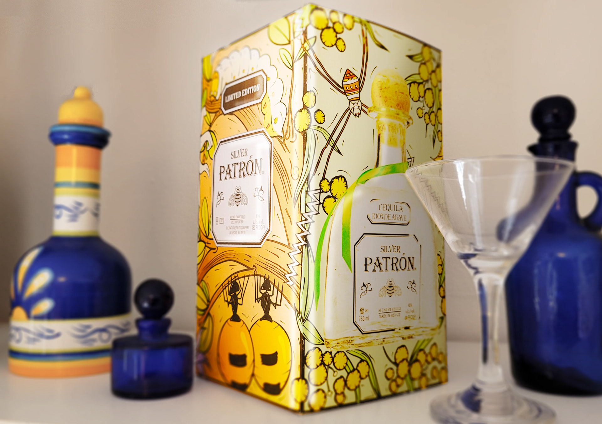
Design a limited-edition Patrón Tequila tin representing Australia.
Design process
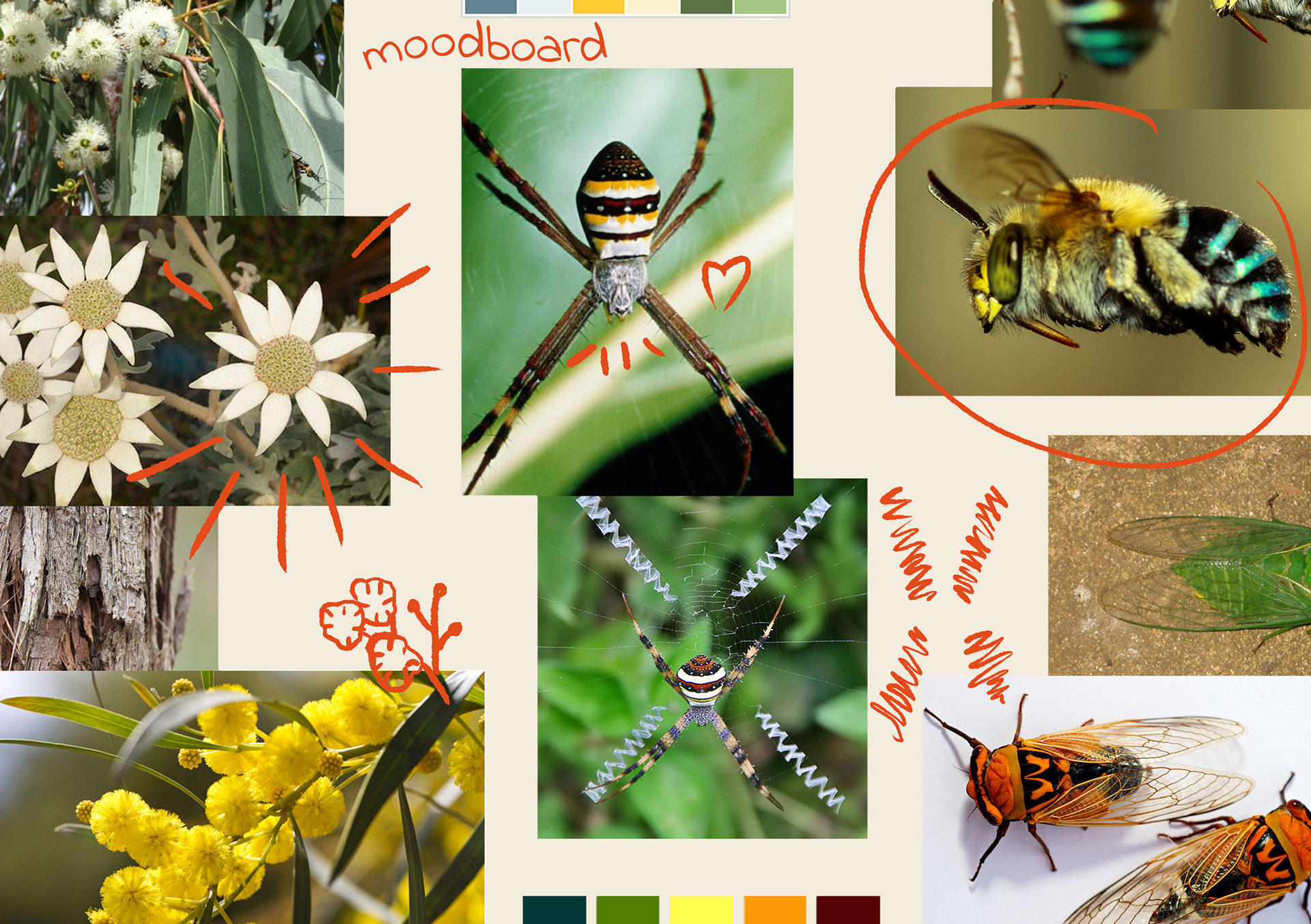
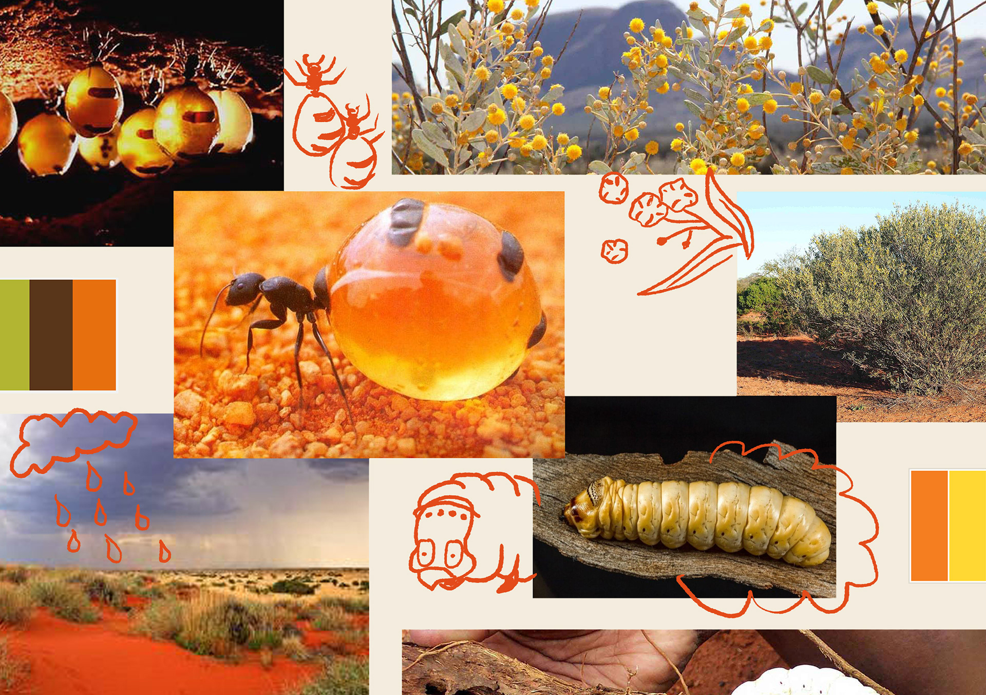
My goal was to understand the story of Patrón Tequila, its market base in Australia and create a design that appealed to Australian and international customers.
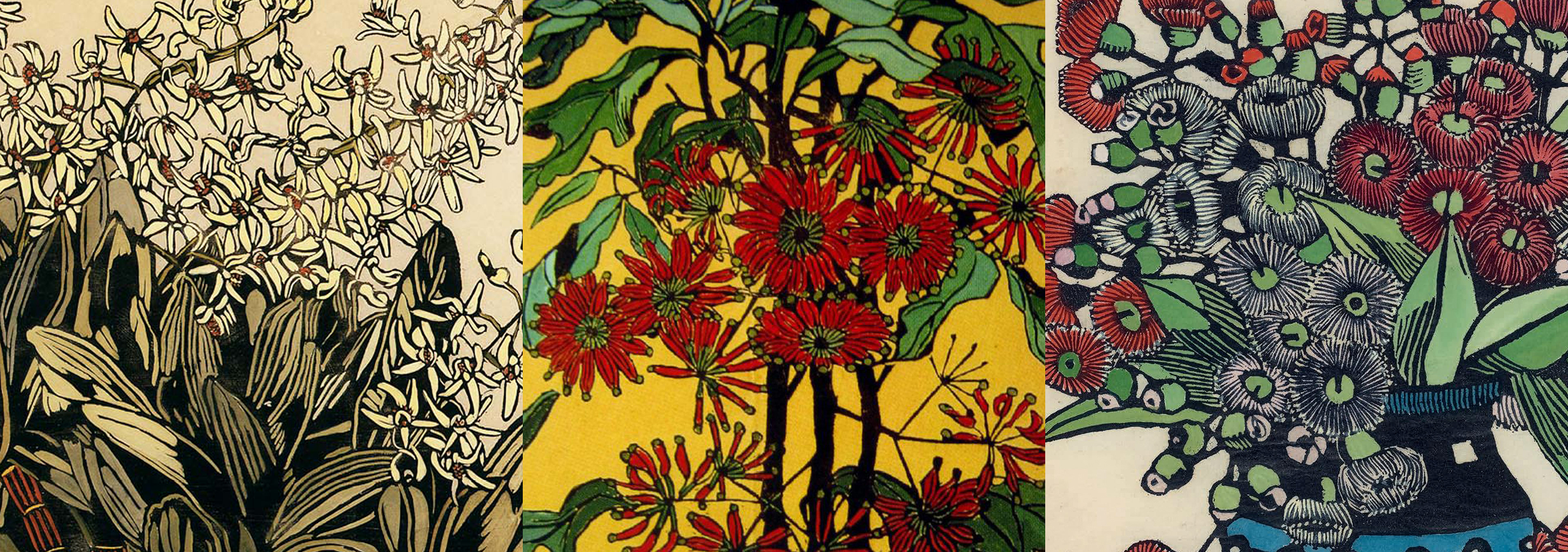
The magic of Margaret Preston. From the left: Australian Rock Lily 1933, Wheelflower 1929, Gum Blossoms 1928
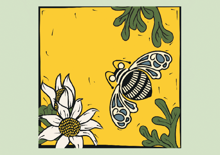
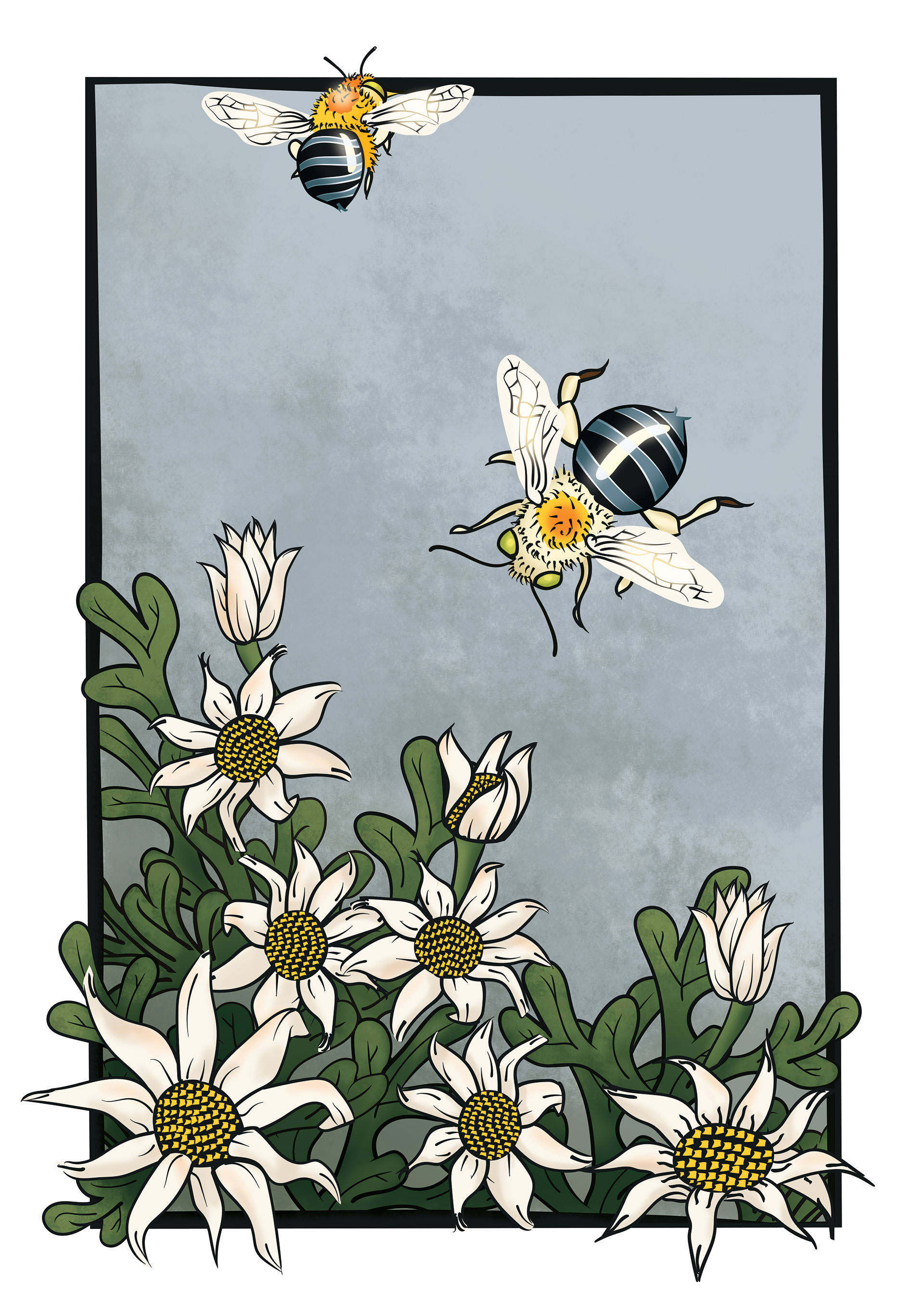
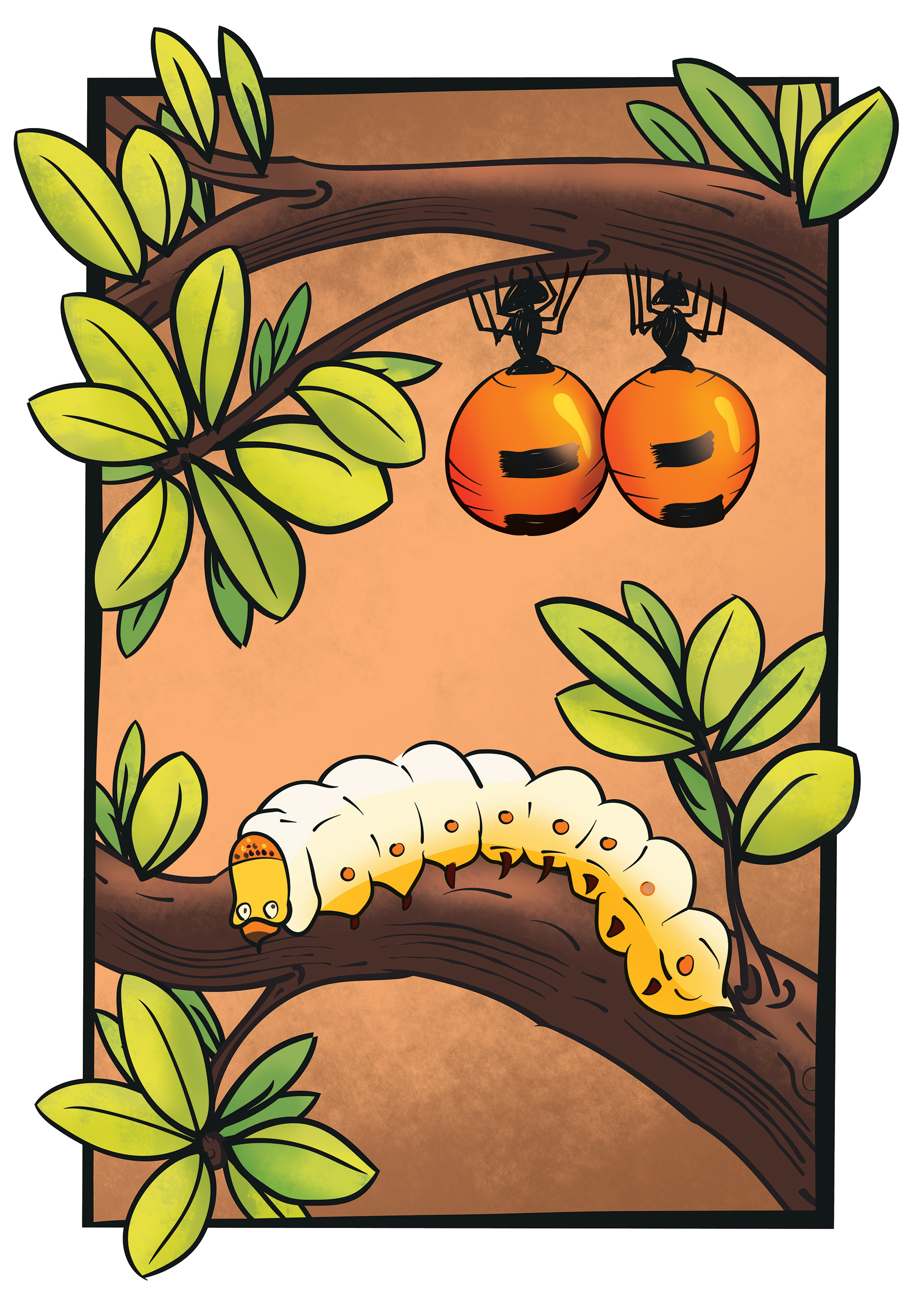
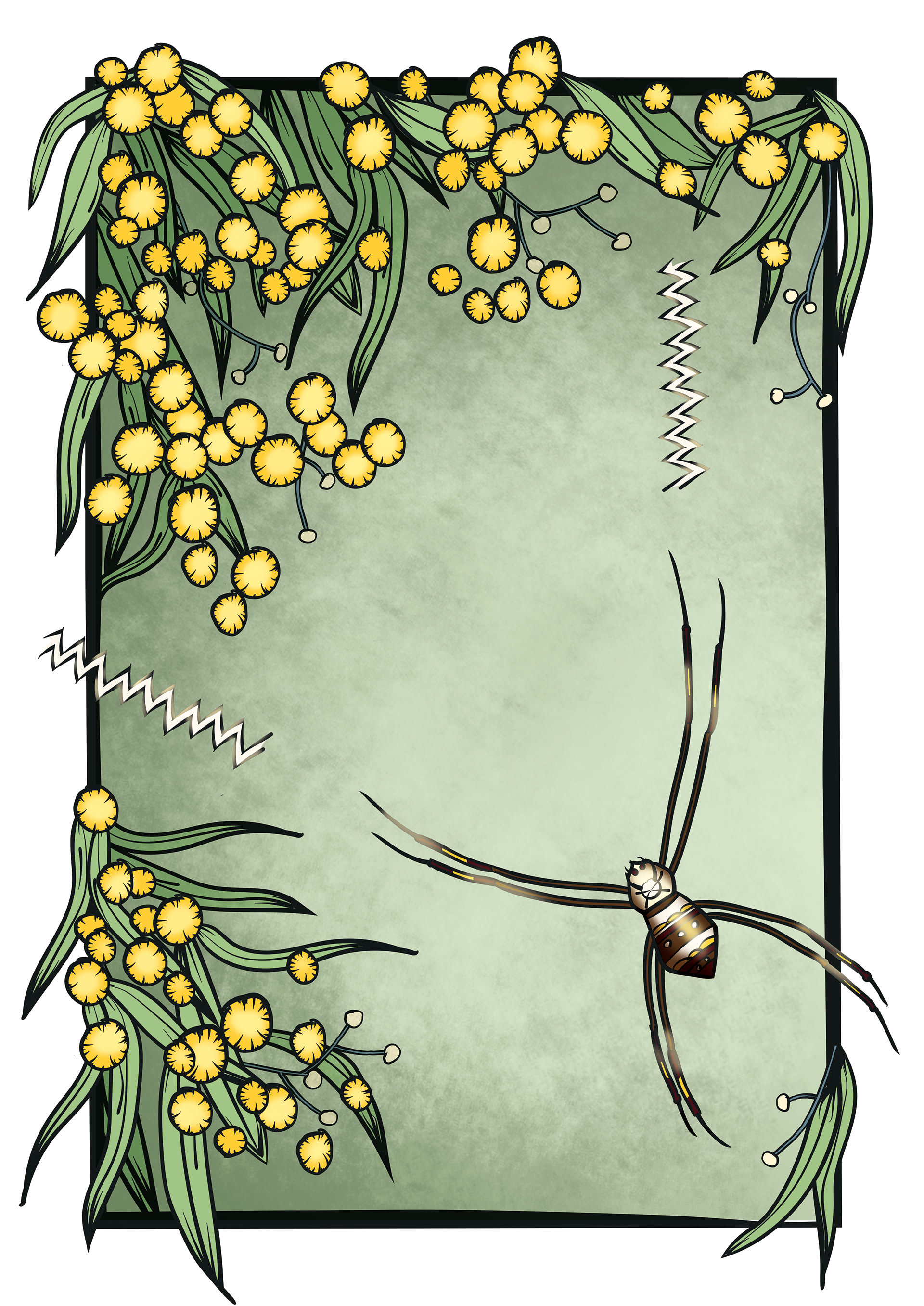
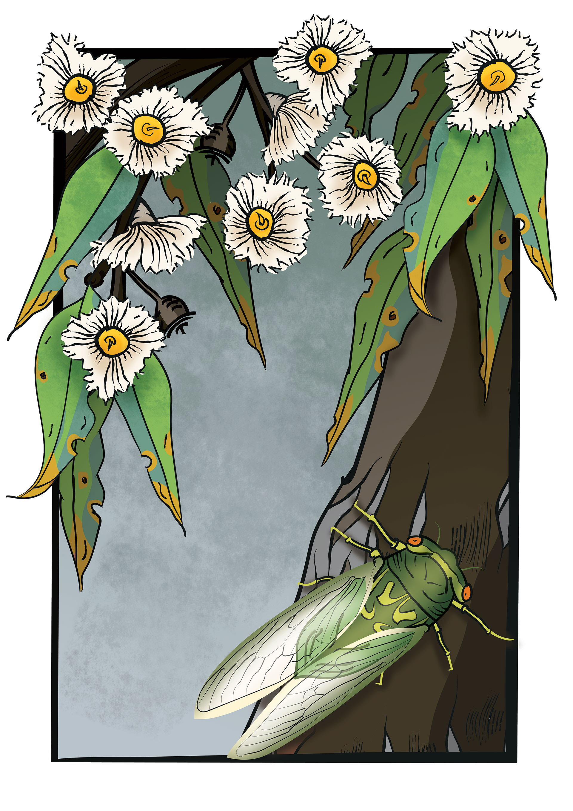
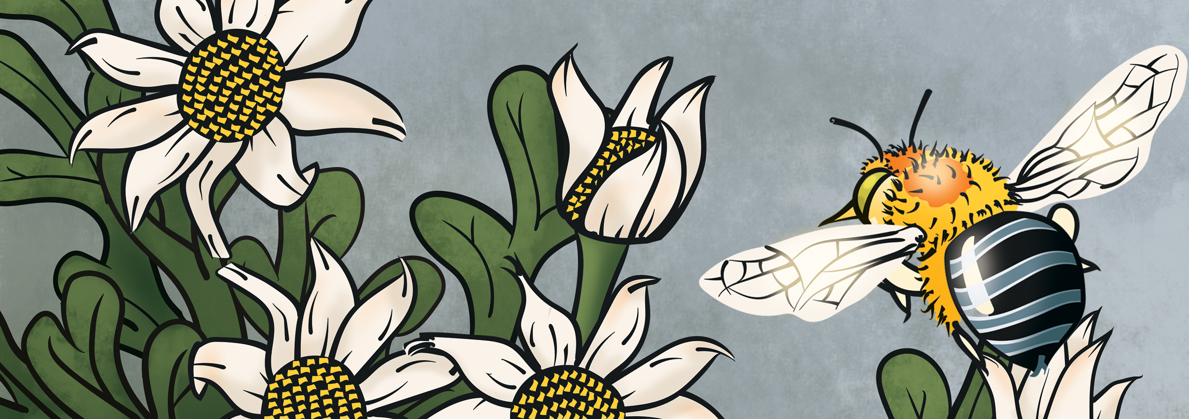
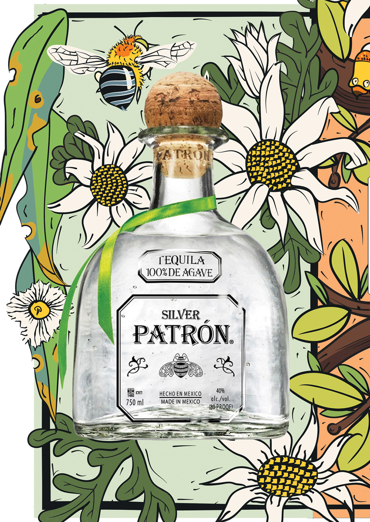
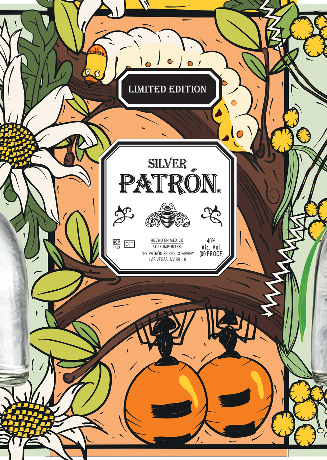
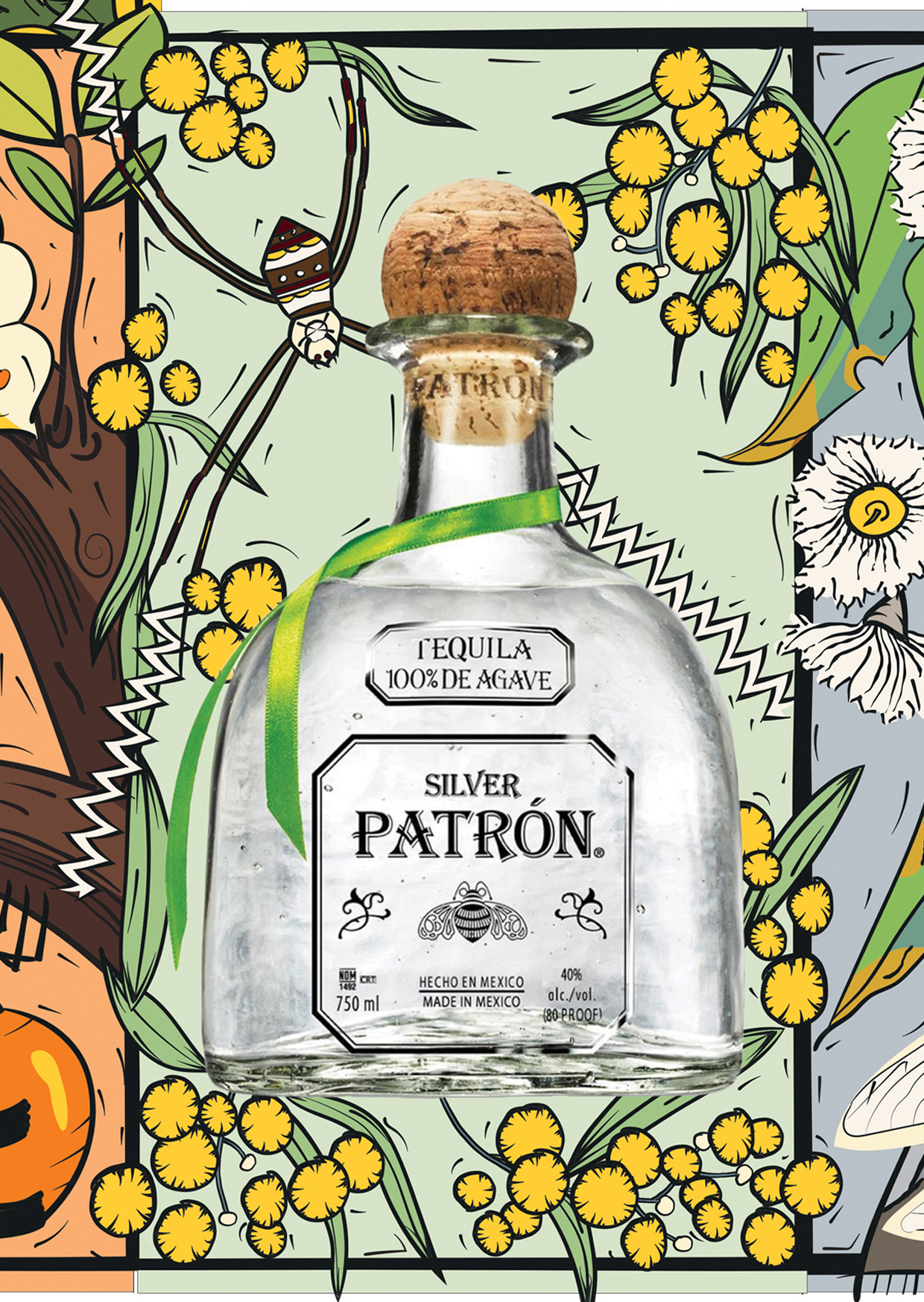
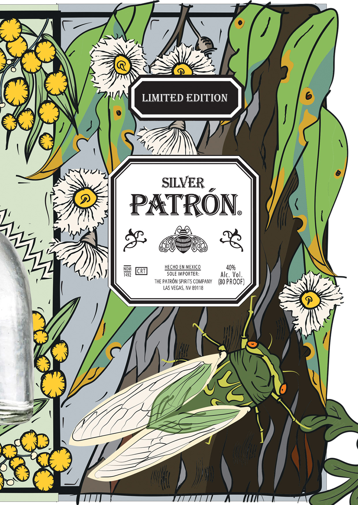
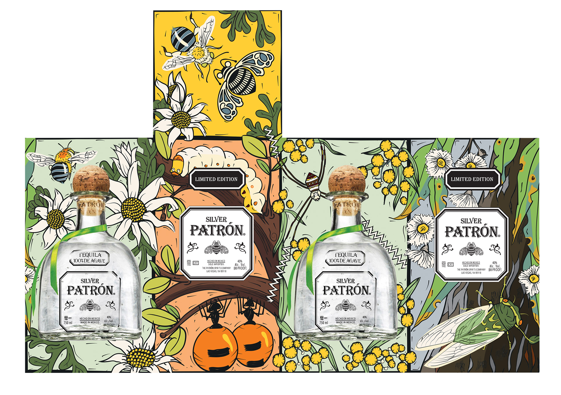
The Patrón Tequila Australiana illustrations and design was based on native Australian insects and plants. Aligning with the uniqueness of the Patrón brand I chose to use some of our most interesting insects: witchetty grubs, honey ants, cicadas and the native bee. I also chose recognisable plants and flowers: wattle, flannel flower and gum leaves.
I chose to apply the iconic style of Australian print maker Margaret Preston to the design as this aligned with the vibrant Mexican aesthetic and bold black lines of Patrón. The colour palette I chose reflects the freshness of the bush, the bright movement of our insects and the red earth of our desert environments, with prominent greens and yellows for our national colours.
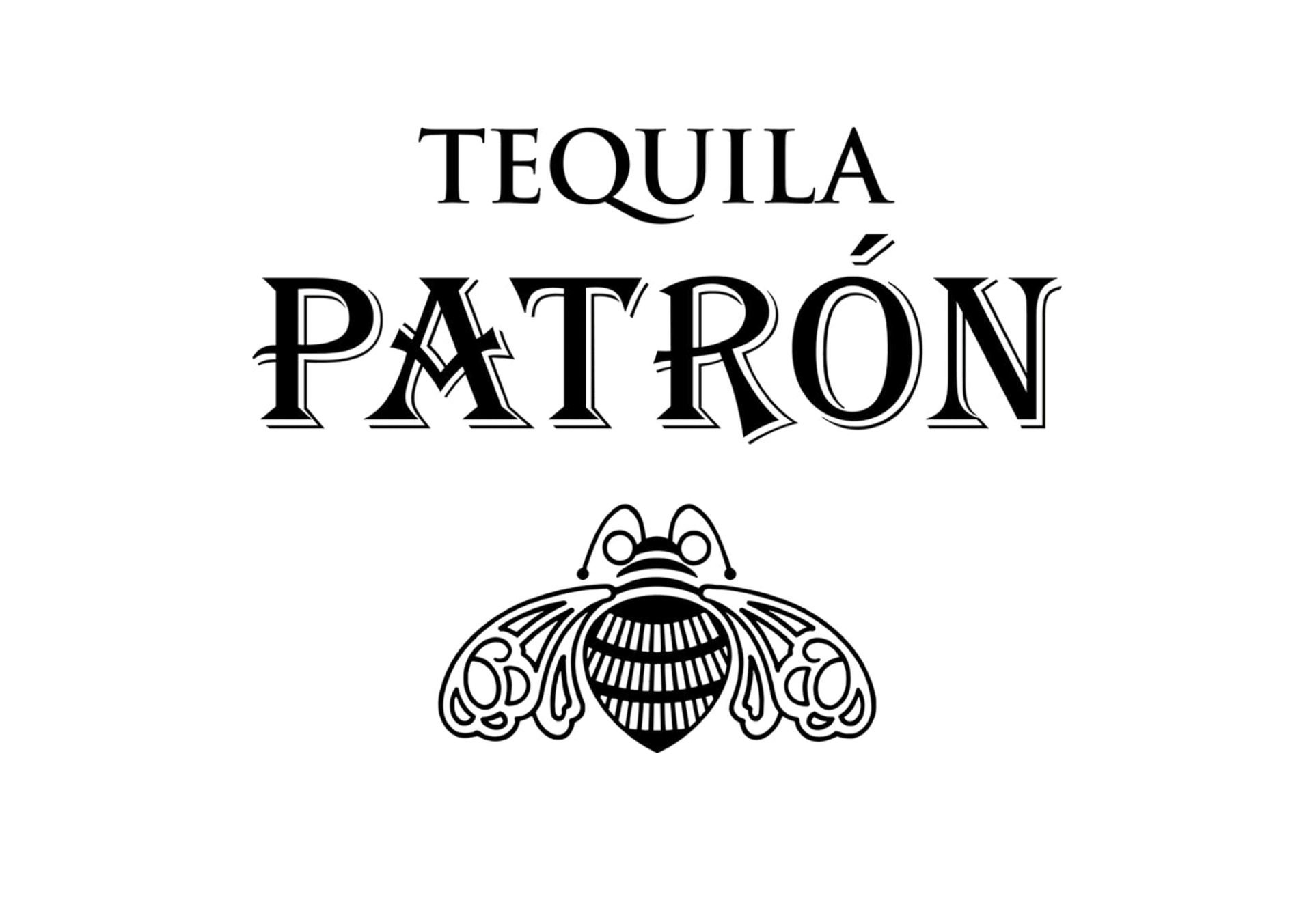
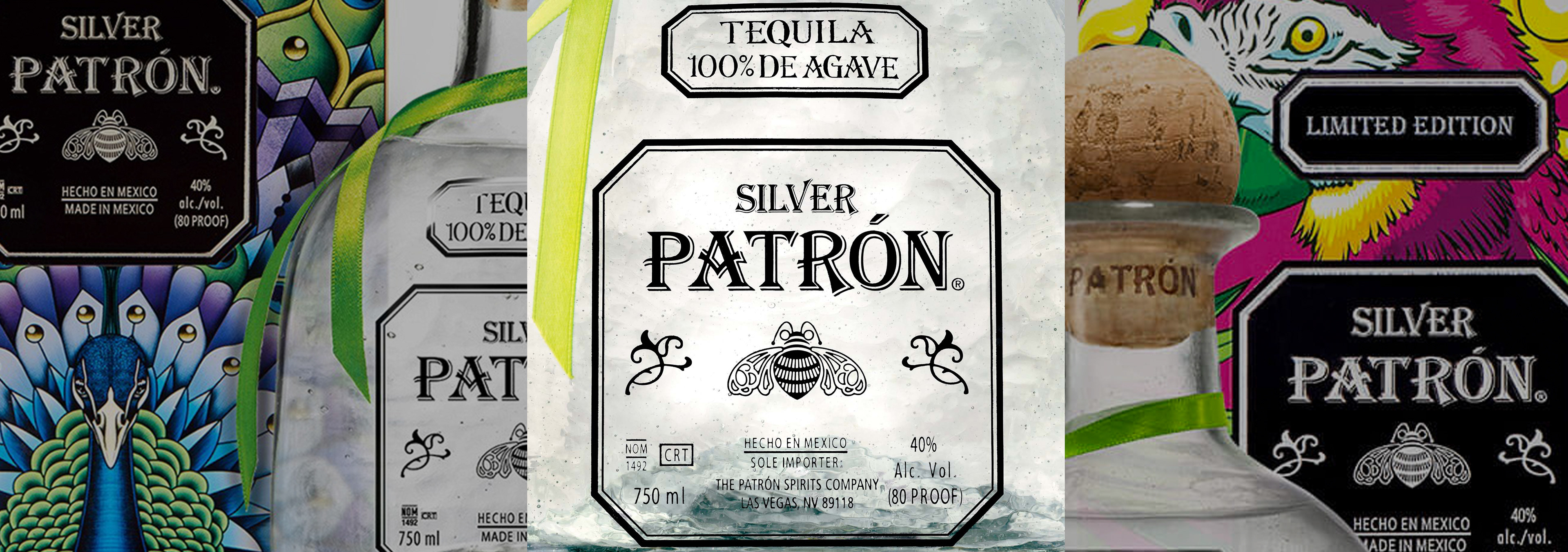
Researching the current Patrón Tequila packaging I learnt the importance of packaging to Patrón. Each bottle is hand blown and the labels and ribbon are applied by hand. The aesthetics of the brand and packaging are instantly recognisable: bold black lines and typography with stylised images of insects, animals and plants.
The result
The final product reflects the iconic look and feel of Patrón Tequila’s design elements: bold lines and typography, stylised images but with a uniquely Aussie twist.